When Beach Architecture Becomes a Color Palette
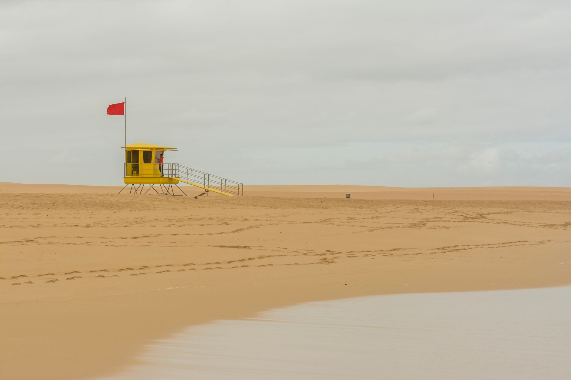
The lifeguard tower is not a subtle object. Planted at the edge of the shore in blazing tangerine, sun-bleached yellow, or high-visibility red, these structures exist to be seen from a distance – their color is the point. What is surprising is how directly that visual logic is now showing up in tailored resort wear, where designers are borrowing not just the hues but the underlying principle: that saturated, clean color carries weight in bright, open environments where muted tones simply disappear.
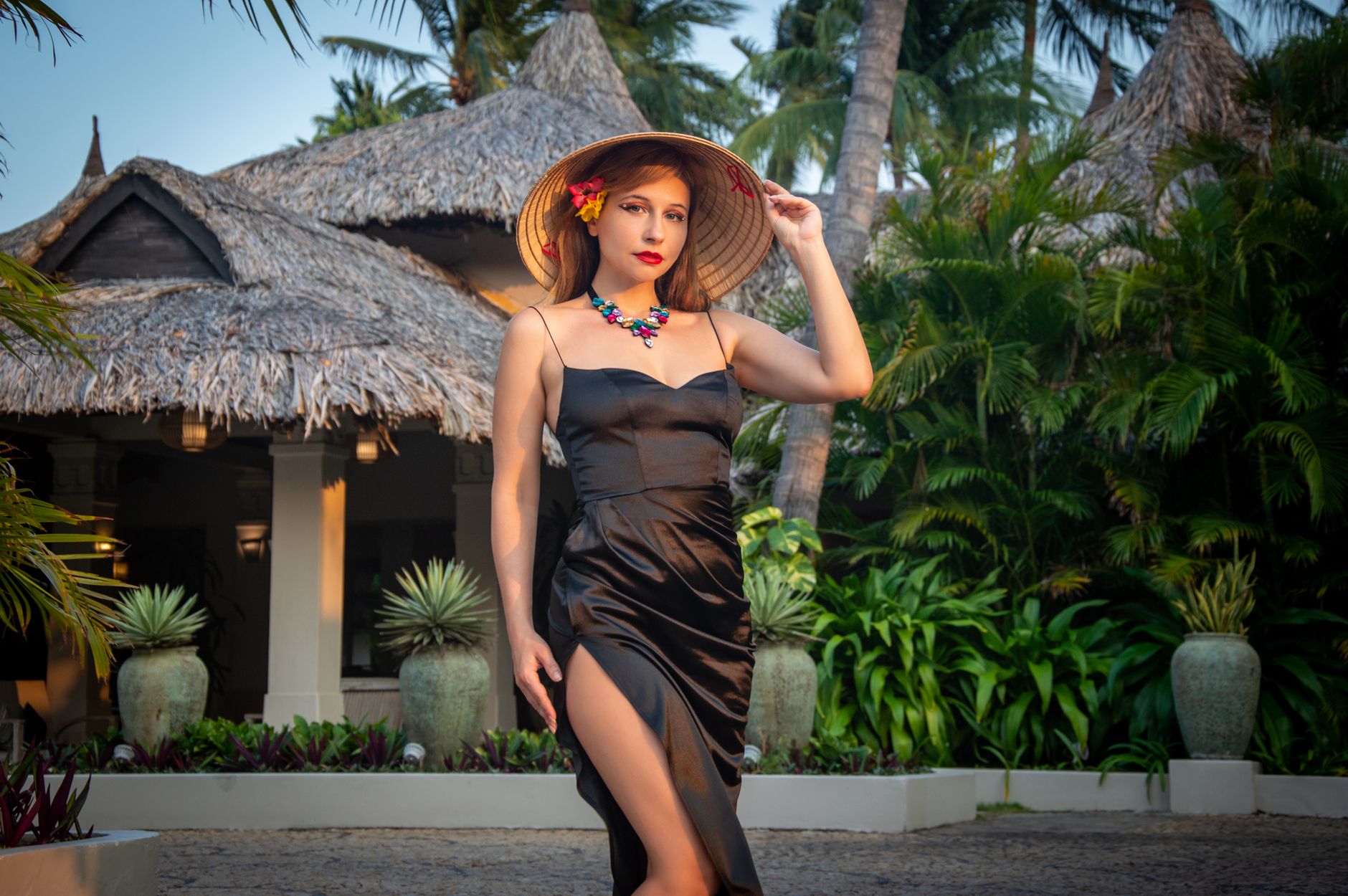
This is not a trend about beachwear itself. The silhouettes in question are structured – blazers with clean shoulders, wide-leg trousers in medium-weight fabrics, linen shirting with strong topstitching. The reference point is a working building on a beach, not a lounger or a cover-up. The distinction matters because it explains why these colors are landing in suiting contexts rather than swimwear capsules, and why the mood reads as confident rather than playful.
The Specific Hues That Are Moving
The tones pulling direct influence from lifeguard architecture are specific in a way that separates them from generic “summer brights.” Rescue orange sits at the warm, almost amber edge of the orange spectrum – closer to a safety cone than to a tropical fruit. Tower yellow skews toward chrome rather than pastel, and the reds involved are true primary, not coral or blush. These are colors with a job to do, and that intentionality is exactly what makes them feel fresh against the backdrop of washed linens and sandy neutrals that have dominated resort collections for the past several seasons.
White plays a structural role in this palette the same way it does on the towers themselves – as a hard contrast rather than a soft backdrop. When a white blazer appears alongside rescue orange trousers, the combination reads as graphic and deliberate, not casual. The architecture of a lifeguard station, often painted in bold geometric blocks of two or three high-contrast colors, gives this color-blocking approach a visual logic that fashion alone might not fully justify. The towers provide a precedent that feels grounded in something real.
Navy and storm blue are entering the palette as anchors. While the brights get the attention, the deeper shades – which appear on tower bases, railings, and signage in many coastal municipalities – give the overall palette somewhere to land. A full look built entirely in rescue orange would be difficult to wear; the same orange blazer over navy trousers reads as resort tailoring that could actually make it to a dinner table. This interplay between the high-visibility brights and their structural counterparts is where the palette becomes functional rather than conceptual.
Fabric choice is doing significant work here. These colors behave differently depending on surface texture – a matte linen in tower yellow reads almost architectural, while the same shade in a silk-cotton blend becomes luminous and liquid. Designers working with this palette are making deliberate choices about surface sheen, which changes the reference from utilitarian structure to something considerably more polished. The color origin stays fixed; the execution shifts depending on the occasion the garment is being dressed toward.
Resort Tailoring as a Category in Its Own Right
Resort tailoring has been quietly building its own identity for a few seasons now – separate from vacation casualwear and distinct from the city suiting it shares construction with. The category needs color that works in strong natural light, holds up against the visual noise of a coastal or poolside environment, and still reads as intentional rather than just bright. Lifeguard tower hues solve all three problems at once. They were built for exactly those conditions.
The category is also being pulled by a growing demand for clothes that can move across contexts without a full change. A well-cut blazer in rescue orange works at a poolside lunch and again at an evening function if the styling shifts underneath it. That kind of versatility requires a color that holds its presence at different hours of the day, under different light conditions – outdoor sun, golden hour, candlelit interiors. High-chroma colors borrowed from safety architecture, counterintuitively, perform well across all three.
How the Reference Gets Filtered Into Wearability
The version of this palette that works in clothing is edited rather than literal. No designer is replicating the visual of a tower directly – there are no stenciled numbers, no silhouette graphics. What transfers is the color confidence: the willingness to commit to a single saturated tone across a full garment without hedging it with prints, texture, or excessive detail. The tower influence operates as a philosophy of color application more than as a direct aesthetic reference. This is the same mechanism at work when paramedic vest designs inspire high-end tactical wear – the function of a working garment or structure informs the logic of a luxury one, without copying its surface appearance.
Proportion is the other key editing tool. Wide-leg trousers in primary red look structured and modern; the same red in a slim cigarette cut starts to feel like a costume. The volume typical of current resort tailoring actually serves this palette well, because generous cuts let solid color fill space in a way that registers as deliberate. It is the difference between a color statement and a color accident, and the tailoring does much of the work in establishing which one you are looking at.
Accessories are being kept deliberately minimal within this palette – thin leather belts in matching or tonal shades, simple slide sandals, no competing prints. The visual logic mirrors the tower itself: one strong statement, clean geometry, nothing extraneous. Where accessory designers are picking up on the palette, it tends to be through boxy structured bags in the same family of brights, which hold their shape in a way that echoes the angular silhouette of the towers the colors came from.

What keeps this trend from tipping into novelty is that these colors do not require context to function. Rescue orange worn in a city boardroom reads as a bold color choice; worn against the sea, it looks almost inevitable. That double life – equally strong in both environments – is rare enough in fashion that when a palette achieves it, the staying power tends to outlast the season it first appeared in.


