

When Rowing Heritage Meets the Knitwear Studio
Eton College’s rowing blades have carried the same visual logic for over a century: bold diagonal chevrons, high-contrast color blocks, and a strict geometry that signals club, year, and rank to anyone who knows the code. What started as a marking system for oars on the Thames has spent decades as a closed visual language – beautiful, precise, and completely inaccessible to anyone outside the Berkshire riverbank. That is changing.
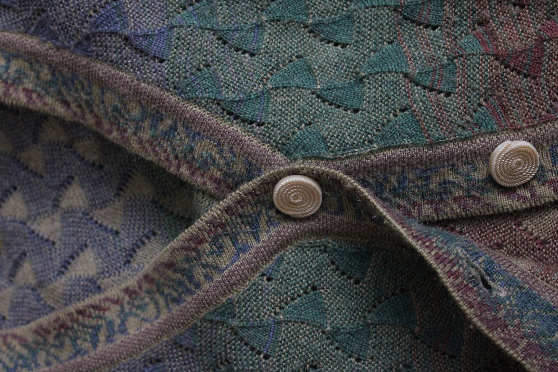
A growing number of knitwear designers are pulling these chevron formations directly into their panel structures, treating the diagonal stripe not as a decorative afterthought but as the load-bearing architecture of a sweater’s construction. The blade chevron translates with unusual ease into intarsia and fair isle techniques because it was already built on grid logic – the same mathematical consistency that governs a knitting chart.
The result is knitwear that reads as deeply considered without announcing its reference.
The Geometry That Makes This Work
Rowing blade chevrons follow a specific angle – typically 45 degrees – with color blocks that alternate in width rather than repeat uniformly. This variation in band width is what separates the aesthetic from standard varsity striping. Where a conventional rugby stripe repeats its intervals, the blade chevron creates rhythm through asymmetry: one wide band, one narrow, shifting direction at the midpoint of the oar’s flat face. In a knitwear panel, that same rhythm produces a visual tension that pulls the eye across the garment rather than simply up or down.
Designers working in this territory tend to concentrate the chevron at structurally interesting zones – the yoke, the sleeve cap, the hip band. These are the areas where knitwear already has to manage directional changes in construction, so embedding a directional motif at those points creates a coherence between structure and decoration. The stripe is not applied to the surface; it grows out of the seaming logic. That distinction matters enormously in how the finished piece wears and how it reads at a distance.
Color selection follows the blade tradition closely, even when designers are not consciously referencing it. Rowing blades historically pair one grounding neutral – navy, black, bottle green – with one high-visibility accent: gold, scarlet, white. These pairings recur because they were chosen to be legible on dark water at speed. In knitwear, the same combinations carry an authority that is hard to engineer from scratch. The contrast ratios feel earned rather than assembled.

Knitwear as Institutional Archive
There is a long tradition of British sportswear codes migrating into civilian fashion, but the rowing blade’s path is more specific than the usual athleticwear drift. This is not about performance fabric or technical construction – it is purely about visual grammar. The blade chevron carries no functional purpose once it leaves the boathouse. What it carries instead is a set of associations: discipline, precision, cold mornings, a particular relationship to tradition that is neither nostalgic nor ironic. That emotional register is exactly what certain knitwear designers are trying to access.
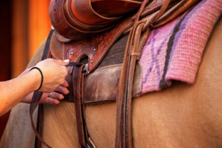
The trend sits within a wider appetite for what might be called institutional aesthetics – the visual systems of schools, clubs, and organizations that were never designed for public consumption but hold a concentrated sense of identity. Saddle cloth piping and other equestrian trim details have followed a similar path into tailored outerwear, picking up the same loaded visual vocabulary from a closed sporting world and redirecting it toward ready-to-wear. The blade chevron operates by identical logic, with the added advantage that it translates so cleanly into knit construction.
What distinguishes this from straightforward heritage borrowing is the level of fidelity involved. Designers working with this reference are not simplifying the chevron into a generic stripe – they are preserving the specific angle, the alternating band widths, and the color discipline that make it legible as a rowing reference to anyone who recognizes it, while remaining entirely opaque as a reference to anyone who does not. That dual legibility is the point. The garment operates on two frequencies simultaneously.
Where the Chevron Lands Next Season
The clearest indication of where this is heading is the placement shift currently happening in knitwear sampling: the chevron is moving from accent panels on sleeves and hems toward full-body construction, where the diagonal geometry structures the entire garment rather than punctuating it. A sweater built entirely on blade-chevron logic, with the directional shift running through the torso rather than contained within a panel, is a considerably more demanding piece to knit – and a considerably more confident statement about where the reference sits. At that scale, the rowing blade stops being a detail and becomes the argument.
Frequently Asked Questions
What are Eton College rowing blade chevrons?
They are the bold diagonal stripe patterns painted on rowing oars at Eton College, using alternating color bands at a 45-degree angle to identify club membership and rank.
How do rowing blade chevrons translate into knitwear?
The chevron’s grid-based geometry maps directly onto intarsia and fair isle knitting charts, making it a natural structural motif for yokes, sleeve caps, and full-body panel construction.