

When the Boathouse Meets the Beach
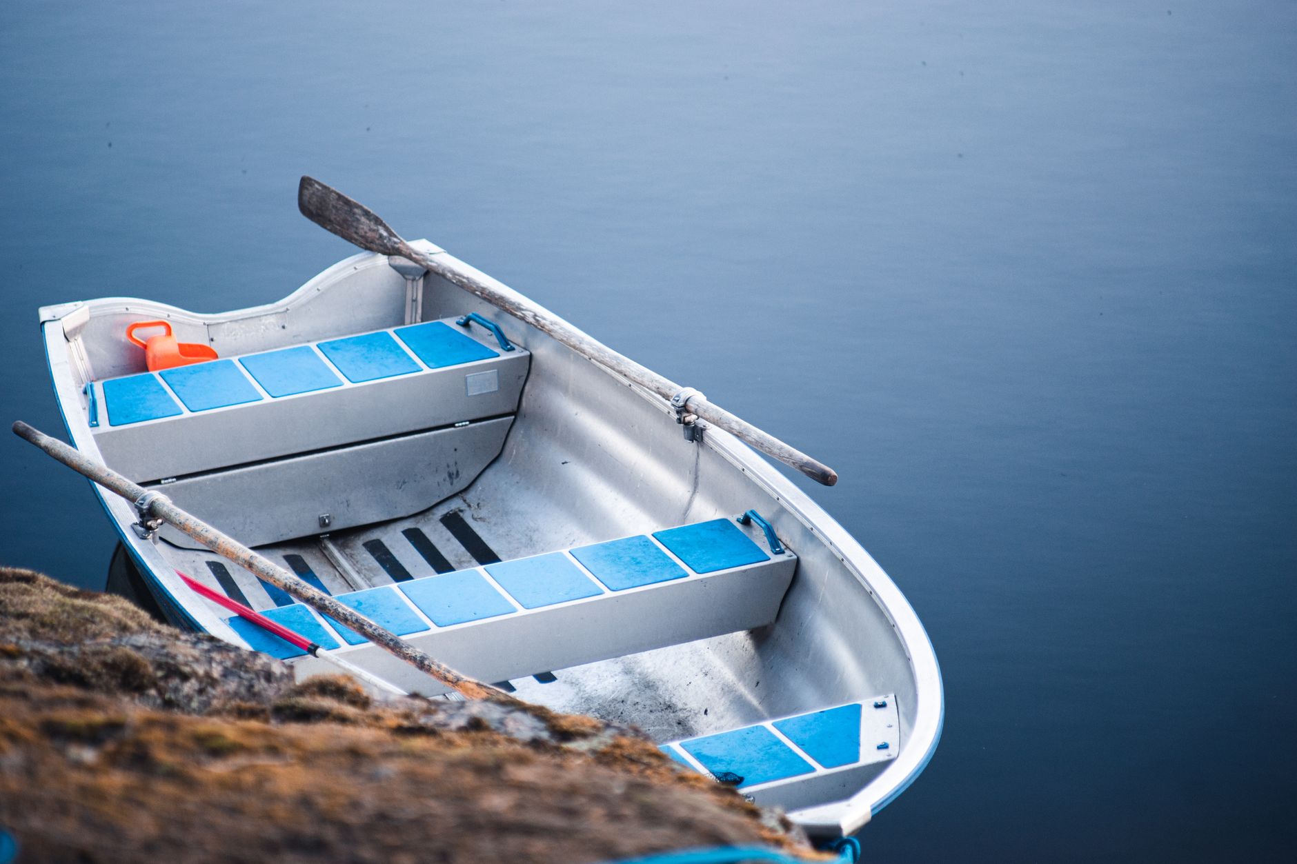
Rowing club blade colours – those narrow, diagonal stripe configurations assigned to university and amateur clubs as team identifiers – have long existed in near-total obscurity outside athletic circles. Each set of colours belongs to a specific club, painted onto the thin wooden blade of an oar, and carries a visual language so precise that rowers can identify rivals by colour alone from across a stretch of water. That same precision is now showing up on resort knitwear racks, translated into horizontal stripe sequences that borrow the palette logic without the sport.
The transition makes a certain kind of visual sense. Blade colour systems favour bold, high-contrast combinations – cardinal against ivory, navy with gold and green, burgundy split by a thin white band – because they need to read clearly at speed and distance. Those qualities translate directly into the kind of stripe knitwear that photographs well, travels light, and holds its own against the flattening brightness of a beach backdrop.
Resort collections live and die by their stripe work.

The Stripe Logic Behind the Look
What separates rowing-inflected stripe knitwear from generic nautical fare is the sequencing. Standard nautical stripes tend to be uniform in width and binary in colour – the Breton stripe being the obvious archetype. Blade colour systems operate differently. They often run three or four colours in a fixed order, with narrow contrast bands separating broader fields, and the proportions are rarely even. That uneven rhythm is what gives the resulting knitwear its visual weight. It reads as considered rather than decorative.
A growing number of smaller knitwear labels are drawing on this system directly, designing stripe sequences that mirror the asymmetric colour logic of actual club assignments rather than inventing colours arbitrarily. The result is that pieces feel like they carry a kind of institutional history even when that history is entirely aesthetic. Worn as a resort pullover or a beach cover-up, the garment suggests a heritage it does not strictly possess – which is, of course, exactly what resort fashion has always done well.
Cotton and linen blends dominate the category at this price point, though some labels are working with merino for transitional-weight pieces that carry into early autumn. The stripe sits flat in both materials, which matters – chunky knit structures would interrupt the colour sequencing and lose the clean band logic that makes the reference legible in the first place.
Where the Trend Is Landing
The pieces gaining traction tend to share a few consistent features: crewneck or boat-neck constructions, dropped shoulders, and a relaxed but not oversized silhouette. The boat-neck choice is almost certainly intentional – it reinforces the aquatic reference without requiring any explicit branding or sport insignia. The garment communicates its source material through shape and colour alone, which keeps it versatile and prevents it from reading as costume.
Styling has followed a consistent logic across the brands working this territory. These pullovers are appearing over wide-leg linen trousers, under slip dresses, and knotted at the waist over high-waisted shorts. The colour sequences, because they tend toward classic combinations – deep navy, old gold, hunter green, cream – sit comfortably within the warm-toned, sun-bleached palette that resort dressing gravitates toward seasonally. Nothing about the colours feels forced into a summer context; they already belonged there.
This same aesthetic impulse – taking the visual identity of a specific sporting institution and abstracting it into wearable fashion – is also visible in how polo club insignia have been moving into graphic outerwear, suggesting a wider appetite for club-sport aesthetics stripped of their original functional context. Rowing blade colours are simply the latest iteration of that pattern, and they arrive with a built-in palette advantage: the colour systems are already beautiful.

The Question of Longevity
Stripe knitwear does not date quickly, which is the strongest argument for the trend’s staying power. A blade-colour-inflected pullover bought this resort season will not look obviously tied to a single moment two or three years from now – the stripe is too classic a structure to carry that kind of expiry date. The real test is whether the specific colour logic holds, or whether the market dilutes it back into generic nautical territory the moment the reference becomes widely recognised. Right now, the gap between the source material and the fashion category is wide enough that most wearers have no idea they are wearing a reworked club identifier, and that distance is precisely what keeps the pieces feeling fresh rather than themed.