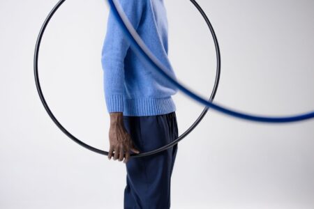


There is a particular geometry to a croquet lawn – the white string boundary lines that define the court’s edges, taut and precise, running parallel to the grass at ankle height. That visual language, borrowed from a sport most people associate with country house weekends and striped blazers, has quietly migrated into fashion’s most restrained corner: the minimalist trouser hem.
What started appearing on runway samples and early-season lookbooks is a thin contrast stripe running along the bottom edge of tailored trousers – not as a bold graphic statement, but as a structural marker. A single line, sometimes two, placed with the same deliberate precision as a court boundary. The stripe does not shout. It simply defines where the garment ends, in the same way a string line tells a player exactly where the game begins.
It is a detail that rewards looking twice.

Why Boundary Logic Works in Tailoring
The appeal of a hem stripe is not purely decorative – it is architectural. A thin contrast line at the trouser hem draws the eye downward and anchors the silhouette, giving a clean finish that bare fabric edges rarely achieve on their own. On wide-leg cuts especially, where the hem can feel unresolved or simply heavy, a boundary stripe acts as a visual full stop. The leg knows where it ends. The shoe knows where it begins.
Croquet’s string lines are functional by design – they exist to communicate information clearly without interrupting the playing surface. Fashion is borrowing exactly that logic. The stripe communicates structure without adding volume, weight, or embellishment in the traditional sense. It is a finishing technique pretending to be a decorative one, which is precisely why it fits within minimalist dressing rather than contradicting it. The trouser remains simple. The hem simply means more.
The color choices being explored reinforce this restraint. Ivory on cream. Navy on stone. Burnt sienna on bark brown. These are not contrast stripes in the streetwear sense – they are tonal differentiations, close enough to the base fabric to read as refined, distinct enough to register as intentional. The craftsmanship required to apply them cleanly at the hem is significant, which explains why the detail is appearing most confidently in mid-to-upper tier tailoring rather than fast fashion.
The Sporting Reference That Actually Holds Up
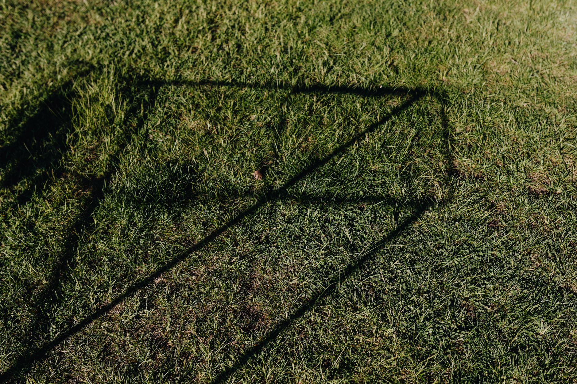
Fashion has a long history of borrowing from sport without committing to the source material – a tennis collar here, a cricket sweater there, worn as costume rather than conversation. The croquet reference feels different because it arrives not through the sport’s iconography (the mallets, the hoops, the striped blazers) but through its infrastructure. The court line is not a logo or a silhouette. It is a principle: precision marking on a natural surface.
That distinction matters for how the trend lands on the body. There is no team affiliation, no legacy branding, no athlete mythology attached to a boundary string. The reference is almost purely formal, which gives designers room to use it without the detail reading as costume or nostalgia. A polo club motif brings specific cultural weight. A croquet boundary stripe brings almost none – it arrives clean, carrying only the idea of a carefully marked edge.
The sporting adjacency also fits neatly into a broader appetite for what might be called lawn aesthetics – a quiet but persistent interest in the visual language of formal outdoor leisure. Rowing club detailing has influenced accessories, most notably the way leather rigger glove cuffs have shaped minimalist wristband silhouettes in recent seasons. The croquet hem stripe follows a similar instinct – taking a precise functional element from a highly structured sport and reading it as a style signal.
How to Wear the Stripe Without Over-Explaining It
The hem stripe works best when nothing else in the outfit acknowledges it. Pair a trouser with a boundary stripe hem against a plain shirt, unstructured blazer, or simple knitwear and the detail operates exactly as it should – noticed eventually, never announced. The mistake would be building a look around it, adding other stripe elements or sporting references that force the eye to read the trouser as a theme rather than a garment.
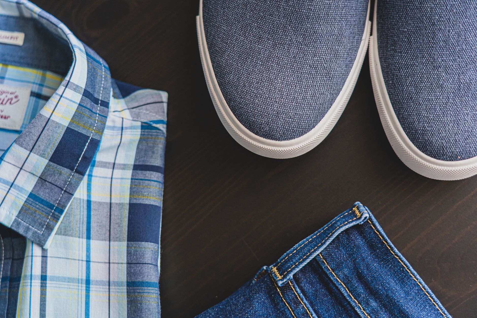
Footwear choices matter more than usual. Because the stripe draws attention to the hem, what sits just below it becomes part of the sentence. A clean leather loafer or a simple pointed flat continues the precision. A heavy trainer or an overly textured boot creates a kind of visual static around the stripe, muddying the exact clarity the detail is designed to produce. The boundary line needs clean space around it to function – exactly as it does on a croquet court.
For those building a wardrobe rather than assembling a trend moment, the boundary hem stripe is a detail worth seeking in quality construction. It is not the kind of finish that holds up when it is printed on rather than sewn or bound. The cleanest versions are worked into the trouser’s hem tape or added as a narrow ribbon-folded edge, which means the stripe stays crisp through wear and washing in a way that surface-applied versions simply do not.
The real staying power of this detail will depend entirely on whether it keeps being executed with the restraint that makes it interesting in the first place – because the moment the boundary stripe gets wider, louder, or applied to five pieces in a single look, it stops being a court line and starts being a costume, and all the precision that made it worth wearing disappears with it.