Polo cross-country colours have always served a functional purpose on the field – bright, distinctive, and readable at speed. Now those same palettes are moving off the turf and into knitwear collections, showing up in heavyweight pullovers, intarsia panels, and collegiate-style crewnecks with an energy that feels both athletic and deeply considered.
The Palette That Built a Sport Is Building a Look
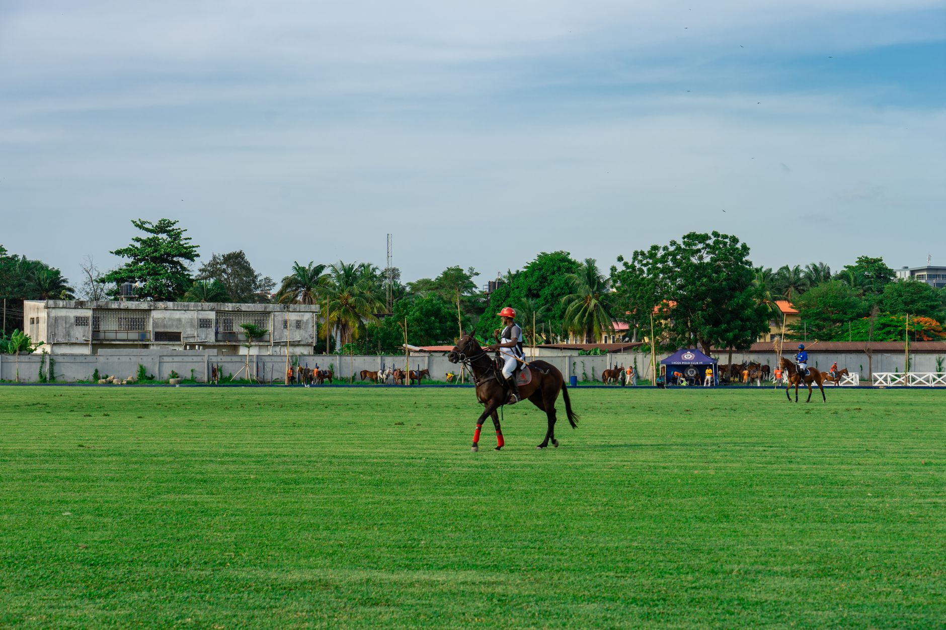
Cross-country polo colouring follows a strict visual logic: team silks need to be identifiable across a field at full gallop, which means bold primary blocks, sharp contrast stripes, and occasional chevron configurations. These aren’t colours chosen for subtlety. They’re chosen for impact. That same visual weight is exactly what makes them work on knitwear, where colour is the primary design tool and pattern does the structural talking.
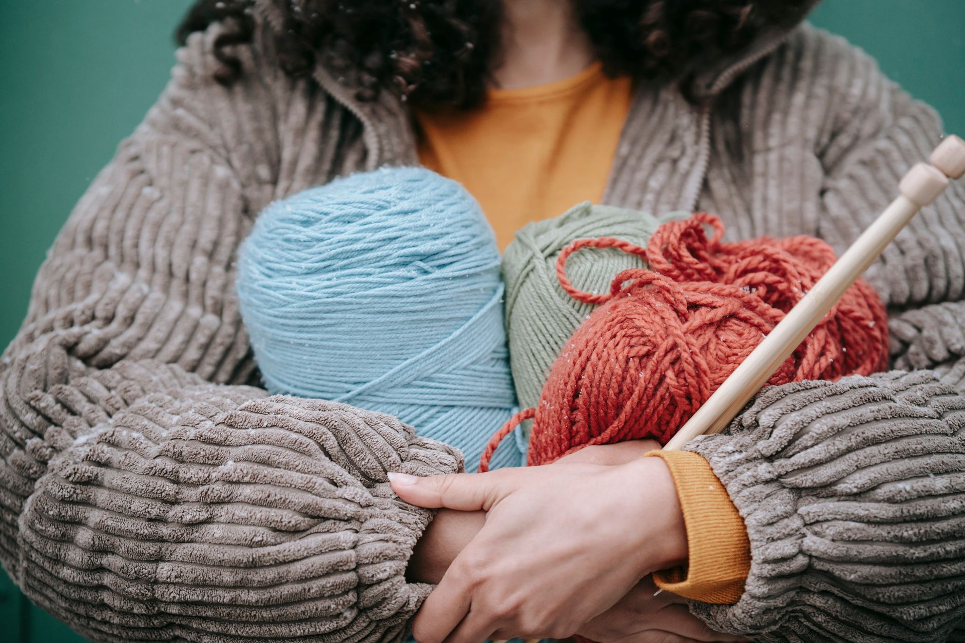
The combinations that are surfacing most often in current knitwear – cobalt paired with cream, bottle green anchored by rust, burgundy cut through with gold – all trace back to equestrian heritage. These aren’t trend-generated colour stories invented by a colour forecasting body. They’re inherited combinations that have existed on polo grounds for well over a century, which gives them a kind of authority that purely contemporary palettes struggle to match.
What makes this more than a heritage revival is the construction. Knitwear designers working with these colours are applying them through intarsia knitting, a technique where separate colour blocks are worked individually rather than carried across the back of the garment. The result is a clean, flat colour boundary with no colour bleed – structurally similar to the way a polo jersey presents its team colours as discrete, readable zones rather than a gradated wash.
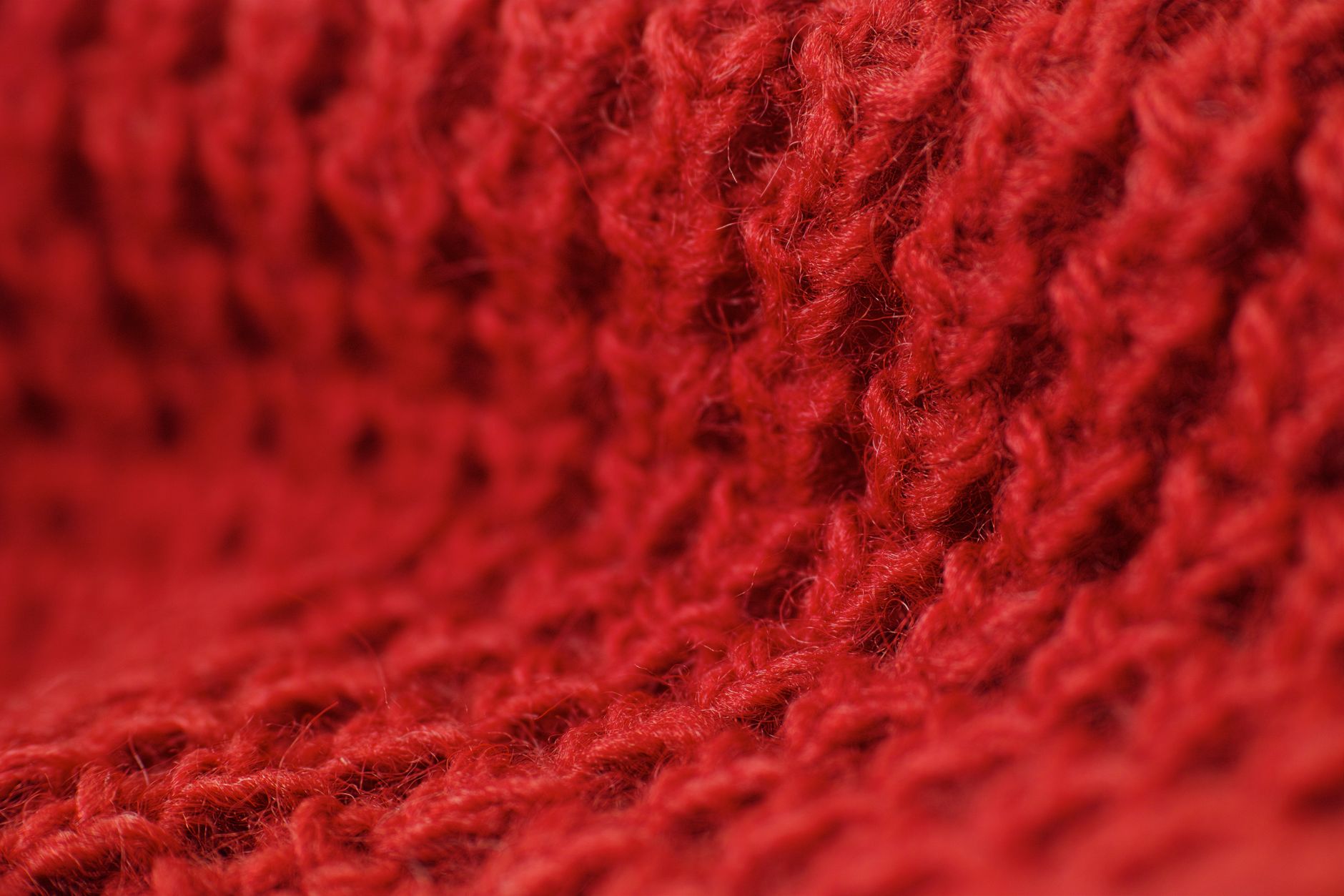
There’s also a weight dimension here. Cross-country polo is a cold-weather discipline, and the knitwear borrowing its colours tends to reflect that – thick merino, boiled wool panels, and heavy cotton blends rather than lightweight layering pieces. The visual boldness of the palette demands a garment with enough physical presence to carry it. A thin-gauge knit in cobalt and cream reads as costume; a heavy crewneck in the same colours reads as conviction.
How the Cross-Country Colour Logic Translates to the Wardrobe
The most direct translation is the block-stripe pullover. Horizontal or vertical bands of two or three colours, wide enough to register as intentional rather than decorative, sit at the core of this trend. The stripe widths in equestrian silks tend toward the generous – designed to be seen at distance – and knitwear is following that proportion rather than scaling it down. That’s a meaningful design choice: wide stripes read as graphic and confident, where narrow stripes read as pattern-making.
Beyond stripes, the polo cross-country influence is showing up in colour-blocked yoke constructions. The yoke – the shoulder and upper chest area of a sweater – becomes a separate colour field, sometimes echoing the way a polo player’s team number or crest sits on the upper body of a competition jersey. This placement creates a natural visual hierarchy, drawing attention upward and framing the face in a way that a full-body single-colour knit simply doesn’t.
Colour pairing discipline is where this trend gets interesting. Polo cross-country colours don’t flatter every combination equally. The combinations that work on the field – and by extension in knitwear – share a specific relationship: high contrast without visual conflict, meaning the colours sit at opposite ends of the value scale (one light, one dark) or opposite ends of the temperature scale (one warm, one cool). Random bold colour combinations don’t carry the same coherence, which is why the equestrian palette functions as a genuine editorial reference rather than just a licensing of brightness.
Styling these pieces follows the same restraint. A bold cross-country palette knitwear piece functions best when the rest of the outfit recedes. Dark tailored trousers, simple leather boots, a single watch or belt in a neutral tone – these let the knit lead without competition. Quarter-zip polo constructions are also surfacing in cross-country colourways, offering a lighter entry point into the palette for those who prefer a less graphic silhouette than a full colour-block crewneck provides.
The seasonal fit is also worth noting plainly. Autumn and winter are when both polo cross-country competition and heavyweight knitwear make the most sense, so the trend lands at a natural juncture. There’s no forced seasonality here – the palettes, the fabrications, and the wearing occasion all point in the same direction. That coherence is part of why the look holds up over multiple wears rather than feeling like a statement piece with an expiration date.
What Separates a Strong Reference from a Weak One
The risk with any sport-to-fashion translation is surface-level borrowing – lifting a colour or a logo cue without understanding the visual grammar behind it. Cross-country polo colours work in knitwear because the underlying logic (bold contrast, readable hierarchy, functional colour pairing) is genuinely compatible with how knitwear communicates. Designers who understand that connection produce pieces that feel grounded. Those who simply pull a “sporty” colour combination without the structural thinking behind it tend to produce knitwear that reads as confused rather than referential.
The stronger pieces currently circulating in this space share one consistent quality: restraint in complexity. A two-colour intarsia block in cobalt and ivory is more convincing than a four-colour stripe arrangement that tries to replicate the full detail of a team silk. The field version and the wardrobe version are different objects with different demands, and the knitwear that acknowledges that distinction – borrowing the spirit of the palette rather than replicating it literally – is the knitwear that actually gets worn past the first season.


