


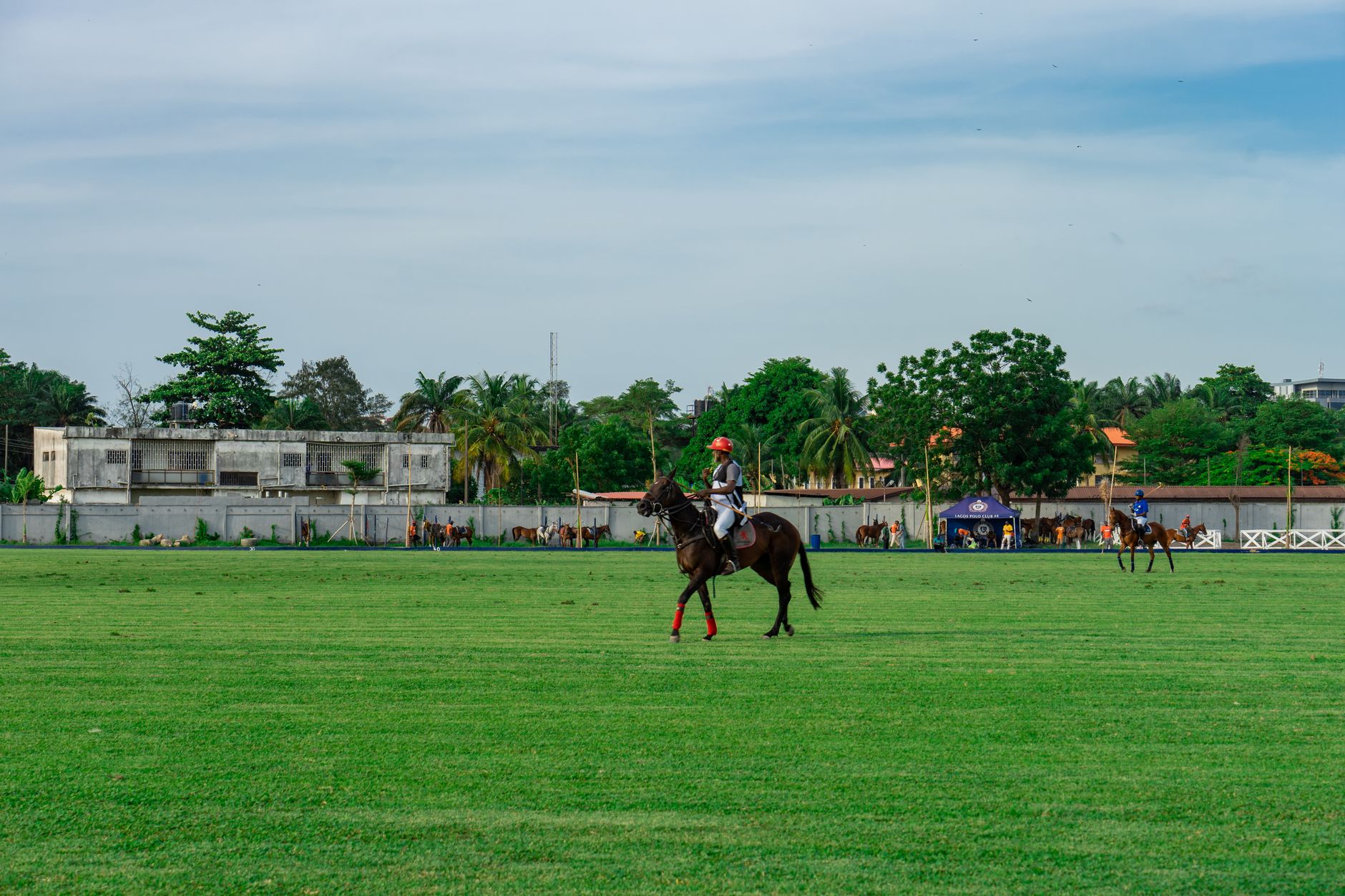
The polo field has always had its own visual language – saddle leather, white breeches, helmet straps, and the bold numbered bibs worn by players to identify position and team. That last detail, the number cloth, is now finding a second life far from the arena, showing up on bombers, technical vests, and oversized coach jackets in a way that feels less like costume and more like design logic.
Where the Reference Comes From
Polo number cloths are the rectangular or shaped fabric panels worn by riders, typically front and back, displaying a large numeral in a contrasting color. They are functional objects – meant to be read at speed from a distance – which means they were always designed with maximum visual impact in mind. High contrast, bold typography, clean borders. The aesthetic was never subtle, and that directness is exactly what makes it work when lifted into a streetwear or outerwear context.
The equestrian world has long supplied fashion with raw material. Riding boots became a wardrobe staple. Jodhpur silhouettes bled into tailoring. Riding gloves have been drifting into minimalist outerwear drops for several seasons now. Number cloths are the next piece of that world to make the crossover – not because they carry nostalgic weight for most people, but because they solve a specific design problem: how to add graphic interest without resorting to logo saturation or abstract print.
The number itself is the point. A large “4” or “7” placed across the back of a jacket carries the same graphic authority as varsity lettering but without the American high school associations. It reads sport, but not a specific sport most people play. That distance is useful. It gives the wearer the energy of athletic dressing without signaling team allegiance or triggering the overly literal readings that come with, say, football jersey graphics.
Color blocking has always been a tool in outerwear, but number cloths introduce a more structured version of it. The panel containing the numeral acts as a discrete zone of contrast – often a different fabric, a different weight, or a different finish – set against the main body of the jacket. This creates layered visual depth without the garment needing to do anything complicated structurally.

How the Detail Translates Across Silhouettes
The translation works best on outerwear with a boxy or relaxed cut. A cropped bomber with a number cloth panel on the back chest area carries the reference cleanly – the shape of the cloth mirrors the functional original, and the proportions allow the numeral to breathe without overwhelming the garment. Oversized coach jackets are equally hospitable, particularly when the number panel sits centered on the back in the way a traditional bib would, framed by blank space.
Technical vests are another natural landing spot. The sleeveless construction means the back panel gets more visual real estate, and the material conversation between a matte technical shell and a slightly shinier or heavier number cloth is more interesting than it would be on a conventional fabric. Some iterations position the numeral on the chest instead, scaling it down but keeping the bib logic intact – a small numbered patch at the sternum that nods to the source material without dominating the front.
Typography matters enormously here. The original polo number cloths used thick, high-contrast letterforms because readability from horseback was the priority. When that same logic transfers to a jacket, it produces a graphic that feels deliberate rather than decorative. Sans-serif block numerals in white on navy, or black on white, or red on black carry the history of the reference without requiring any explanation. The number does not need to mean anything specific – it just needs to look like it belongs to a system.
Fabric choice shapes how equestrian or how streetwear the final result reads. A waxed cotton body with a canvas number panel sits firmly in the country-sport register. A nylon shell with a bonded or embroidered number patch pushes the same concept toward outdoor technical territory. Wool melton with a felt number cloth goes somewhere else entirely – closer to varsity heritage, though the shape of the panel and the cut of the garment keep the polo reading alive. The same graphic source material can point in multiple directions depending on what surrounds it.
Layering behavior is another reason this detail works in outerwear specifically. A number cloth panel on a vest means the numeral stays visible when a jacket is worn underneath, and it creates an interesting visual conversation when the collar or cuffs of an inner layer show beneath it. The graphic becomes part of a composed look rather than a standalone statement, which is exactly how equestrian dressing works at source – every element in a polo kit relates to the others, and nothing is arbitrary.
What Makes This Feel Current
Fashion has been working through a broader retrieval of sport subcultural references that don’t come from mainstream athletics. Polo occupies a precise position in that conversation – it carries class connotations, yes, but it also carries genuine functional design history that has nothing to do with luxury signaling. The number cloth is useful, graphic, and structurally interesting. Those qualities matter more right now than heritage prestige.

The version of this trend that has staying power is not the one that leans into polo aesthetics wholesale – full kit references, crest embroidery, the whole sporting tableau. It’s the version that isolates a single functional detail and gives it room to operate as a design element rather than a costume cue. A jacket with a number cloth panel reads as considered. A jacket that looks like a polo rider’s complete wardrobe reads as theme. The difference between those two outcomes comes down to restraint – and right now, the brands doing this well are choosing the one detail and letting everything else stay quiet.